Data quality dashboards are visual tools that display important metrics and indicators related to the quality of your data.
These dashboards serve three main purposes.
Firstly, they help you evaluate the quality of your data sources and datasets, which can prevent the use of unreliable or irrelevant data that may compromise analysis, machine learning models, and decision-making processes.
Secondly, they help you monitor the quality of your data by identifying and tracking data quality issues such as missing values, outliers, duplicates, errors, or inconsistencies that may arise due to data transformations, integrations, or manipulations. This monitoring is essential for improving your data quality.
Thirdly, data quality dashboards help you communicate the quality of your data to stakeholders such as clients, managers, or colleagues. This can help you build trust, credibility, and transparency.
Table of Contents
DQOps Data Quality Operations Center is a data quality platform that has numerous built-in data quality dashboards that can be easily customized. Please refer to the DQOps documentation to learn how to start monitoring your data quality.
What to consider to build a good data quality dashboard
A good data quality dashboard should have a clear and logical layout that is easy to understand. It should also allow for easy comparison between different time periods, such as the current and previous month, and enable filtering for different time periods. Users should be able to drill down through connections, stages, priorities, data groups (suppliers, countries, business partners, etc.), tables, columns, data quality dimensions, and check types. Additionally, the dashboard should allow for the export of data to an Excel file when it is necessary to share information about a data quality issue with additional people or external partners who do not have access to the dashboard.
Data quality dashboards could be categorized into three groups based on their intended audience and purpose: governance, operational, and detailed.
Governance dashboards show high-level data quality KPIs, aggregated on a macro scale. These views show the key data quality KPIs for the current time period at the business unit, vendor, supplier, or subsidiary level, compared with the metrics for the preceding time period. Data quality scorecards are the highest level governance views that should be shared with senior management.
Operational dashboards enable the Data Engineering Team and the Data Owner to identify the areas (tables or data pipelines) in the data warehouse or data lake with the highest number of data quality issues that should be addressed. The Data Quality Team assists in this process by reviewing any false positive alerts. Detailed views show detailed information at the table or column level.
Detailed dashboards are used by the Data Engineering Team and the Data Owner to better understand the data during the investigation phase when the data quality issue is being diagnosed and later to confirm whether it has been resolved.
Steps for making data quality dashboards
During the design and development of data quality dashboards, several tasks must be completed. These include building a data quality warehouse, selecting a business intelligence environment, connecting the business intelligence platform to the data quality database, selecting relevant data quality metrics and indicators, and designing different dashboards depending on the audience.
Let’s look at the steps in more detail.
- Build a data quality warehouse. The data quality results used to create data quality dashboards must be aggregated in a database. If a custom data quality database is used, it may be a significant effort beyond the scope of just one step in the process because data modeling and data ingestion activities must be performed. You can check our blog post to learn how to create a dataset with data quality results in BigQuery.
- Select a business intelligence environment. Choose from a variety of commercially available business intelligence technologies such as Sisense, Tableau, Power BI, or Looker Studio. The cost of the business intelligence platform used to present the data quality dashboards should not be neglected. The data engineers and some Data Owners may not have a license for a business inteligence platform. Moreover, additional specialists who may be involved in the incident resolution must be granted access to data quality dashboards, which may require covering additional licensing fees.
- Connect the business intelligence platform to the data quality database. The business intelligence tool must be connected to the data quality database. Below, we describe an exampl of how to connect data to Looker Studio.
- Select relevant data quality metrics and indicators. You need to decide how will you quantify and visualize the data. You may use percentages, counts, ratios, charts, or colors to represent the data quality metrics and indicators. You should also select data streams for aggregation of data quality KPIs. The relevant data stream hierarchy levels that identify data sources, data streams, vendors, business partners, subsidiaries, or data pipelines must be selected.
- Design dashboards for different stakeholders. You need to decide how to organize and present the data quality metrics and indicators on the dashboard. There are many options to enhance the usability and functionality of your dashboard such as filters or drill-downs. The development of custom data quality dashboards should be planned according to the Agile process. For each requested data quality dashboard, the development process should involve the requirement review, mockup preparation, mockup review, development, and testing.
How to connect a business intelligence platform to the data quality database
As an example, we describe how to connect data quality results stored in BigQuery to Looker Studio (formerly known as Data Studio). We will be using a sample dataset, dq_check_results table, that contains results from data quality checks. A sample of the table is shown below. To learn how to create a dataset, please read our blog on how to store data quality results.

The dq_check_results table has the following columns:
uuid: a unique id for each result
tested_resource: the name of the analyzed table
test_name: the name of the data quality check
value: the result, in this case, the number of null values per day
created_time: the time the result was saved
day_of_tested_data: the day when the data was tested, in this case, it is a date for which NULL values were counted
Currently, the table has results for three data quality checks: row_count, max_delay_in_minutes, and null_count. Therefore, we need to filter the results first. We will focus on describing the results of the NULL count for the online_retail_II table. There are a few ways to do this, each with its own advantages and disadvantages.
To prepare data for a dashboard, we can create views in BigQuery. This allows us to quickly and easily visualize selected data. However, depending on the size of the table and the complexity of the query, dashboard performance may suffer.
Another option is to use Looker Studio to extract the information and create additional data sources. This works by connecting Looker Studio to the table and then extracting only the data we want to use in the dashboard.
We can also connect Looker Studio with an original table from BigQuery and create dashboards directly from it. However, this approach is more complicated. We need to filter the data for every table or chart in Looker Studio, which may take more time for a data engineer who is fluent in SQL. Moreover, this approach runs the risk of omitting the required filter, resulting in incorrect or misleading data being displayed. The main disadvantage is that Looker Studio has to process all the data from the table, which negatively impacts the time needed to load dashboards. Therefore, we will not cover this solution in this article.
How to create a view in BigQuery
					SELECT DISTINCT tested_resource
FROM `dqo-learning.data_quality.dq_check_results`
WHERE test_name LIKE 'null_count'

The query returned only one record, so everything is correct.
Now we know how to filter the data. The query that creates the view is shown below.
					SELECT uuid AS id,
    day_of_tested_data,
    value AS number_of_null_values,
    created_time
FROM `dqo-learning.data_quality.dq_check_results`
WHERE test_name LIKE 'null_count'
In order to create a view, we need to expand SAVE and select a Save View option and complete the information necessary to create the view: project name is set automatically, you have to specify the dataset and name the view.


How to extract required data from a table in Looker Studio
To be able to add data stored in the BigQuery dq_check_results table to Report we need to first create a data source in LookerStudio. Login to Looker Studio, click the Create button in the top left and select Data Source.

Next, select the type of data to which you want to connect which is BigQuery in our example.

If you do this for the first time you will be asked to authorize the connection.
Now, we can select the dataset and the table where the null_count_results are stored.

In the main Looker Studio screen, in the Recent category, we can now see the dq_check_results table.

To connect Looker Studio with the previously created null_count_results view in BigQuery, we can follow the same steps. Firstly, we need to create a data source that contains only the necessary data, similar to our view in BigQuery. To do this, we will create a new data source and select “Extract Data” from the Google Connectors option.

Now we should complete the fields like dimensions and data range.


We want to add metric – a sum of null values per day. Use the Add metric button, then select the column on which the metric will be applied, in our case – value.

By default, the sum is selected as the aggregation function. To change it, click on the square with the inscription “sum” on the left side and select a different function.

The next step is to apply filters. To do this, find the “Filter” section and click on ADD A FILTER. Then, complete the formula and save it. In our case, we only want to see results with a “null_count” check, so our filter should contain this information.

Finally, the page for extracting data source should look like the image below. As you can see there is also an option to set auto-update.

There are now two tables in recent data sources.

Creating a dashboard with Looker Studio
Looker Studio offers a wide variety of built-in visualization elements such as charts, tables, and gauges, which you can use in dashboards. As an example, we will create a table, and a column chart.
To create the first report, click the Create button in the upper left corner of the Looker Studio main website and this time select Report. In the Add data to report page select ‘My data sources’, then choose a data source. In this case, we choose null_count_results and we approve it using Add bottom on the right-down corner.

When we perform a NULL check, we need to identify which data source had the highest number of NULL values and when it occurred. To obtain detailed information, we can retrieve a data quality result id. We will then create a pivot table with a heatmap that displays outlier values (i.e. the number of null values) using a color gradient.

The automatically created table needs some modifications.

On the right side, there are two tabs: Data and Style that allow for modification of the added elements.

We need to make some changes to the table to ensure it meets our assumptions. To achieve this, we should remove “day_of_tested_data” from the column dimension and add it to the row dimension. The improved table displays the days with the highest number of null values and the corresponding IDs for technical people who would resolve the issues.

To make the table more friendly for business users, we need to rename columns. We can do this using the square with the inscription ‘ABC’ on the left side of the column or metric name.


The table is almost ready. Since NULL values are associated with incorrect data, we can change the color of the column to red.


Sometimes, presenting data in a table format may not be the most effective way to convey information. In such cases, creating a column chart can be a better option. For instance, to display the daily count of NULLS during a week (from 2 December 2011 to 9 December 2011), you can click on “Add a chart” and select “Column chart”. The dimension should be set to “day_of_tested_data” and the metric to “value”.

Add a filter to select the proper date. Click the Save button.


The chart is currently sorted by the dimension “value” in descending order. However, we need to sort the data by date in ascending order. To do this, please click on the three dots located on the right-hand side corner of the chart, then select “Sort by” and choose “date”.
Additionally, we will change the color of the chart to match the table.
You can see the entire layout of this simple dashboard in the image below.

Examples of the built-in dashboards of the DQOps platform
Creating data quality dashboard can take a lot of time and sometimes it is better to use a dedicated solution.
We created DQOps data quality platform to simplify the data quality monitoring. DQOps has numerous built-in dashboards that can be easily modified to suit your needs. Our dashboards use Looker Studio (formerly Google Data Studio) business intelligence environment.
All data quality results are synchronized to a private data quality data warehouse in the Google Cloud. Data quality projects implemented with DQOps receive a complementary Looker Studio instance connected to a data quality data warehouse, so you do not need to build a warehouse by yourself. DQOps customers can ask the vendor to access a custom Looker Studio data source, providing direct access to the data quality lakehouse. You can check our documentation for a detailed guide on how to create a custom dashboard in DQOps.
But it is easier to use our built-in dashboards. Examples of different dashboards are presented below, and you can check out more DQOps data quality dashboards in our documentation.
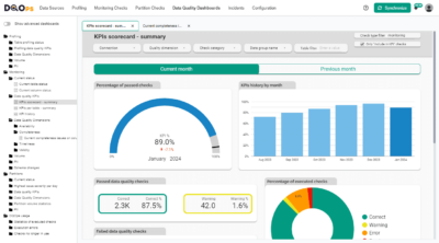
KPIs scorecard - summary

The dashboard above shows the data quality KPIs scoreboard. This dashboard is an example of a governance dashboard as it provides a quick overview of the data quality useful for upper management.
It includes a gauge displaying the percentage of passed data quality checks, a monthly summary of KPIs in a bar chart, and boxes showing different statuses of checks: Correct, Warning, Error, and Fatal. These boxes also indicate the quantity and percentage of checks with each status. A pie chart represents the percentage of executed checks and the results.
Filters available at the top of the dashboard, enable to filtering the results by connection, categories, or a table.
KPIs history
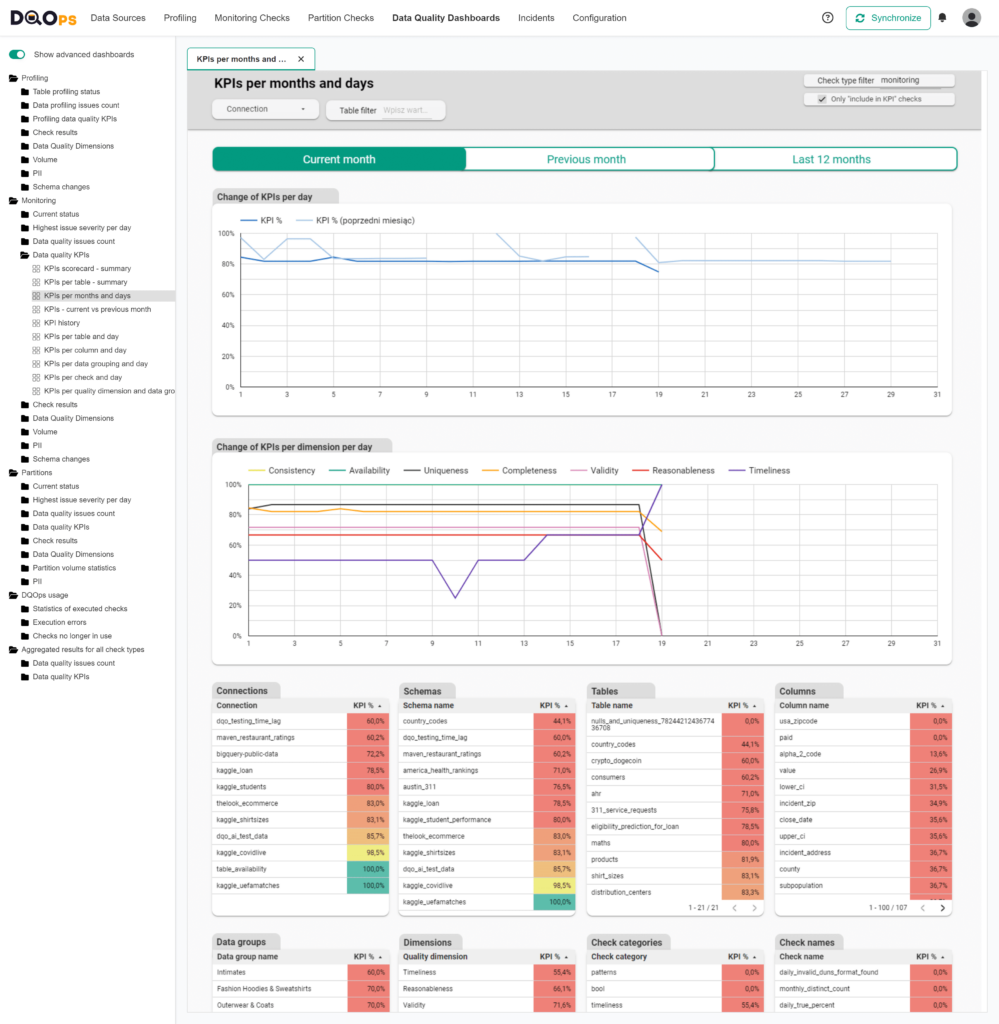
The above dashboard exhibits the historical record of data quality key performance indicators (KPIs). This dashboard is an example of a governance dashboard that provides a more detailed inspection of the KPIs
The dashboard displays tables with data quality KPI values for connections, tables, columns, data groups, data quality dimensions, check categories, and even individual checks. You have the option of filtering the data by clicking on any row, and additional filters at the top of the dashboard allow you to filter results by connection or a particular table. Additionally, you can switch between the views of the current and previous month with ease.
At the bottom of the dashboard, there is a line chart showing changes in data quality KPIs per day of the month.
Current table status
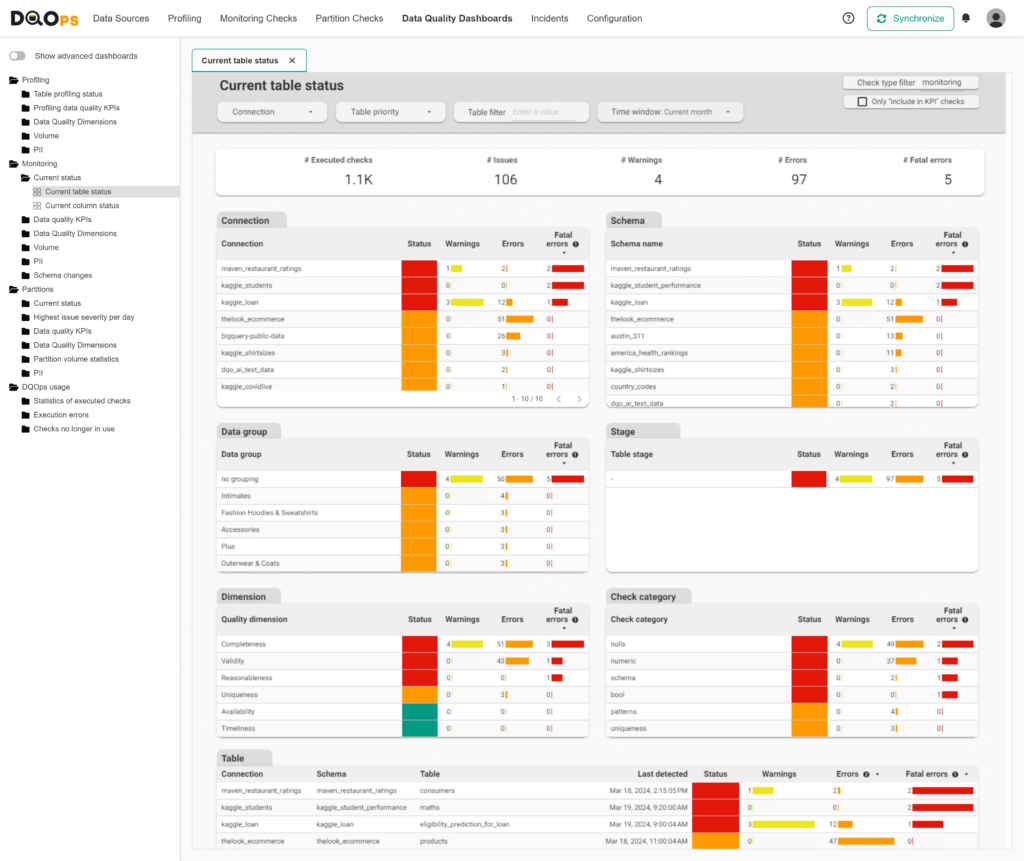
The Current table status dashboard is an operational dashboard that helps to identify the areas within the data warehouse or data lake with the highest number of data quality issues that need to be addressed.
This dashboard displays different tables that show the number of alerts raised by data quality check evaluations. In the DQOps platform, data quality checks can define the alerting threshold at three severity levels: warning, error, and fatal.
The results are aggregated at different levels such as connection, schema name, data quality dimension, data group name, and table. The highest severity level detected is indicated in the Status column. This shows the tables, connections, or dimensions that you should work on to fix the issues.
The filters at the top allow the data to be filtered by different time windows.
Current data quality check results
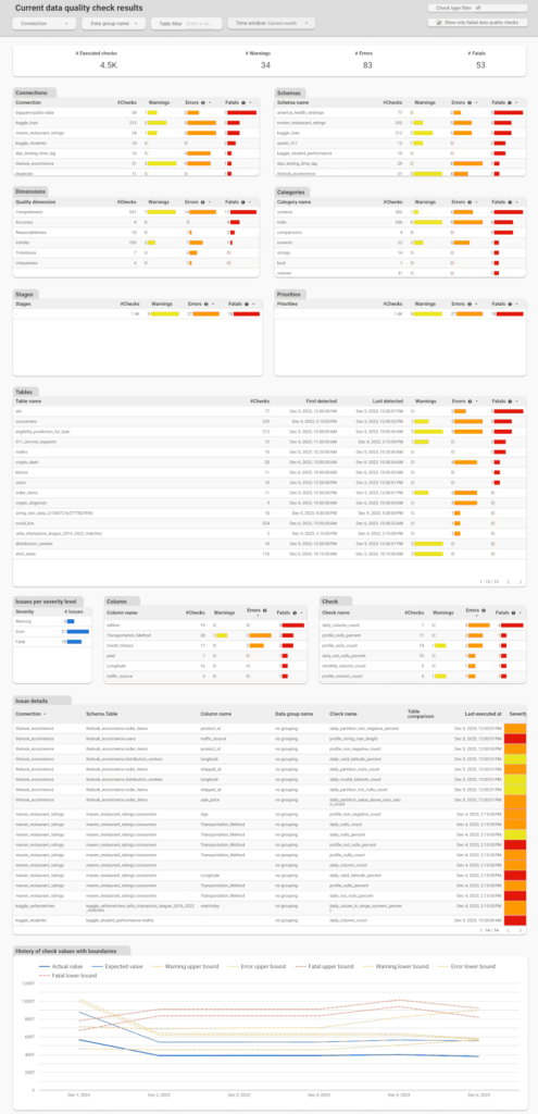
The Current data quality check results dashboard is a detailed dashboard that can help the Data Engineering Team and the Data Owner during the issue investigation phase and later to confirm whether the issue has been resolved.
This dashboard provides an overview of the results aggregated at various levels such as connection, schema name, data quality dimension, check categories, stages, priorities, tables, columns, severity levels, and check name. The Issue Detail Table presents a list of all executed checks with detailed information about the results, including actual and expected values, and threshold bounds that have been set.
The filters located at the top of the dashboard allow users to filter the data by different time windows.
Details of execution errors
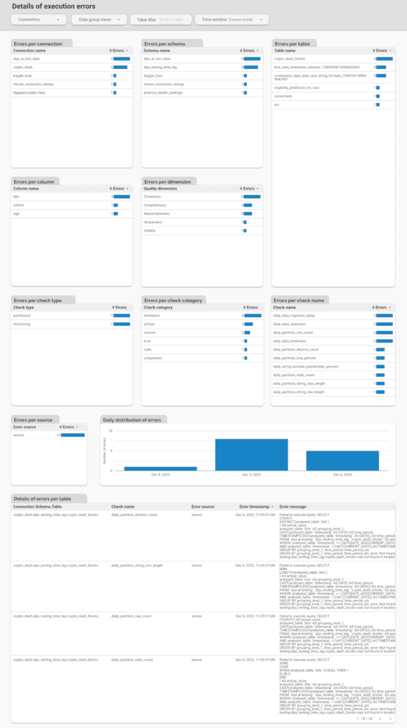
The Details of Execution Errors dashboard is a useful tool for monitoring the performance of the DQOps monitoring platform. It displays the number of errors that occur during job execution, categorized by connection, schema, table, column, dimension, check type, check category, and check name. At the bottom of the dashboard, there is a table showing the details of each error, including the error message. This dashboard enables users to quickly identify the number of errors, locate the table where they occurred, and identify what was the cause of the error.
There are more dashboards to explore, check out the DQOps data quality dashboards section in our documentation.
How to use data quality dashboards for data quality monitoring
Data quality monitoring is the process of tracking the health of your data, identifying tables with errors, and taking action to correct them. Data quality dashboards are a powerful tool for effective data quality monitoring. They provide insights into the current health of your data, allow you to filter errors by severity, and help you track data quality incidents that need resolution.
Within a data team, you’ll typically find engineers specializing in different areas or roles. Data engineers build and maintain data pipelines, while DevOps engineers manage deployments. Some organizations also have dedicated data operations teams responsible for data monitoring and ensuring adherence to Service Level Agreements (SLAs) by promptly addressing any issues.
Custom data quality dashboards can significantly improve data quality monitoring by tailoring them to specific data teams and job functions. For example, you can create a dedicated dashboard for data engineers that displays only tables with outdated data or those affected by data quality issues. This dashboard could utilize data from ETL pipeline logs to highlight recent errors. If you have an incident tracking system, the dashboard can show a list of newly created, unassigned incidents.
Additional data quality monitoring dashboards can be created for data owners and managers to provide a high-level overview. These dashboards might include key performance indicators (KPIs) related to data quality and their trends, a list of delayed tickets, and statistics on the resolution of data quality tickets for each data source or data team.
What is a data quality report
Data quality reports provide a snapshot of the current health of your data. They are often used at the end of a data quality assessment to establish a baseline before starting data cleansing. In regulated industries where maintaining high data quality is paramount for compliance with standards like ISO certification, these reports may be generated and published regularly.
A comprehensive data quality report should present the health status of each data source, dataset, table, and column. This status is typically conveyed through data quality metrics, such as the percentage of invalid or missing records. For assessments that encompass an entire database or multiple data quality checks on a single dataset, aggregated metrics like data quality KPIs can be used. These KPIs might measure the number of passed and failed data quality checks.
Data quality reports should be easily shareable with any data stakeholder, regardless of their access to data quality tools. They should generally be read-only documents. To create professional-looking reports suitable for presentation to regulatory bodies or external auditors, generating them as PDF files is often the best approach. Modern business intelligence (BI) tools with data quality dashboarding capabilities can be instrumental in achieving this. You can design a data quality dashboard layout that aggregates all essential metrics onto a single page, then export the dashboard’s content to a PDF for distribution to stakeholders.
How to build a data management dashboard
Building a robust data management dashboard requires a deep understanding of your data ecosystem and the technical components that drive it. Forget the fluff about layouts and interactive elements – let’s focus on the raw data and metrics that truly matter to data governance teams.
Essential Data Sources for Data Management Dashboards
Data Quality Scores: Integrate data quality scores to provide an objective assessment of your data’s health. Track metrics like completeness, accuracy, consistency, and validity to identify areas needing attention.
Data Pipeline Error Logs: Don’t just monitor success; delve into the error logs of your data pipelines. This reveals the frequency and nature of integration issues, enabling proactive troubleshooting and optimization.
Stage-Specific Dashboards: Design separate dashboards to monitor data at different stages of its lifecycle. For example:
- Ingestion Stage: Track data freshness, volume, and validity upon arrival.
- Cleansing Stage: Monitor the effectiveness of your data cleansing processes by tracking error rates, transformation success, and data quality improvements.
Data Catalog Integration: Leverage your data catalog to enrich your dashboards. Display metrics like the number of documented tables, data lineage, and schema changes to promote data discovery and understanding.
Database Metadata: Extract valuable insights from your database metadata. Track the number of tables, data volume growth, and schema complexity to understand your data landscape and plan for capacity.
Performance and Cost Metrics: For the truly hardcore, incorporate technical metrics like CPU utilization, query performance, and cloud spending (especially in pay-as-you-go environments). This provides a holistic view of your data environment’s efficiency.
The goal of effective data management dashboards
A well-designed data management dashboard aggregates these diverse data sources to provide a comprehensive and technically detailed picture of your entire data environment. It’s about empowering data engineers with the insights they need to ensure data reliability, performance, and cost-effectiveness.
How to build a data pipeline monitoring dashboard
Data pipeline monitoring dashboards are crucial for maintaining the reliability and performance of your data infrastructure. To achieve a comprehensive end-to-end view of your data pipelines, you need to aggregate and analyze various types of logs and metrics.
Essential Data Sources for Data Pipeline Monitoring
Orchestration Tool Logs and Databases: Dive deep into the internal logs and databases of your orchestration tool (e.g., Apache Airflow). Calculate metrics like average and maximum execution times for each pipeline and task. Identifying long-running tasks can help you anticipate potential delays or failures that could lead to missing data.
Data Pipeline Code Logs: Capture the logs generated by your data pipeline code itself. Whether stored as flat files or pushed to a cloud logging platform, these logs provide valuable insights into the inner workings of your pipelines.
Internal Logs and Databases: Many data pipelines utilize internal tables for tracking purposes. These might include lists of processed files, error logs, or custom metrics. Incorporate this data into your monitoring dashboard to gain a deeper understanding of pipeline behavior.
Data Quality Validation Results: If your pipeline incorporates data contracts, data quality checks, or validation steps (either before ingestion or after transformation), capture these results. This helps correlate pipeline performance with data quality outcomes.
Data Freshness Metrics: Utilize a data observability tool (like DQOps) to track data freshness. Identifying outdated tables can point to faulty data sources or pipeline issues that prevent complete data loading cycles.
The goal of effective data pipeline monitoring dashboards
An effective data pipeline monitoring dashboard consolidates all these data sources to provide a global view of your pipeline health. It should highlight:
- Pipeline Health: Quickly identify pipelines experiencing issues or delays.
- Performance Bottlenecks: Pinpoint operations that are taking longer than expected.
- Recent Errors and Issues: Surface the latest errors and issues requiring attention from the data engineering team.
By centralizing this information, your data pipeline monitoring dashboard becomes an indispensable tool for ensuring data reliability, identifying performance bottlenecks, and proactively addressing potential issues.
Data quality best practices - a step-by-step guide to improve data quality
- Learn the best practices in starting and scaling data quality
- Learn how to find and manage data quality issues
Conclusion
Data quality dashboards have three key purposes: to assess the quality of data sources and datasets, to monitor data quality by identifying and tracking data quality issues, and to communicate the quality of data to stakeholders. By using data quality dashboards, you can prevent the use of unreliable or irrelevant data, improve data quality, and establish trust, credibility, and transparency with stakeholders.
Therefore, building data quality dashboards should be an essential element of your data quality strategy. Building data quality dashboards involves creating a data quality warehouse, selecting a business intelligence environment, connecting the business intelligence platform to the data quality database, selecting relevant data quality metrics and indicators, and designing different dashboards for different audiences.
Choosing a complete data monitoring solution, such as the DQOps platform, which includes a variety of customizable data quality dashboards, can save you a lot of work.
To learn how to start measuring data quality, check out the DQOps getting started guide.
You can also download our free eBook “A Step-by-Step Guide to Improve Data Quality,” which describes our proven process for assessing data quality, monitoring it, and reacting to data quality issues.
FAQ
Find answers to common questions about data quality dashboards.
Data quality dashboards provide a centralized view of your data’s health, presenting key metrics and visualizations that allow you to quickly assess and monitor data quality. By tracking metrics like completeness, accuracy, and consistency, you can identify potential issues, prioritize areas for improvement, and ensure your data remains reliable and trustworthy. Customizable dashboards can be tailored to specific data sources, pipelines, or teams, enabling efficient monitoring and proactive data quality management.
How to get started with DQOps?
DQOps is a data quality tool available as both a Python package for local use and a Docker container for production deployments. The free version of DQOps includes a local data quality metrics database that stores all the necessary data for your data quality dashboards. Additionally, DQOps provides complimentary access to a data quality data warehouse and a suite of over 50 pre-built data quality dashboards hosted in their SaaS environment. To get started with DQOps, follow the “Getting Started with DQOps” guide, which will walk you through the download, local setup, and activation of your free data quality dashboards.
Where to find data quality dashboard examples?
The best way to explore data quality dashboard examples is by downloading DQOps and running it locally. The free version of DQOps provides complimentary access to a collection of data quality dashboards hosted in their SaaS environment. These dashboards are built using Looker Studio, and you can open each one in edit mode to examine the layout and underlying data model. This allows you to learn from real-world examples and gain insights into building effective data quality dashboards of your own.