Last updated: June 26, 2024
Review the data quality results on dashboards
Read this guide to learn how to use detailed data quality dashboards in DQOps for drilling down to identify all tables and columns affected by issues.
Overview
DQOps has multiple built-in data quality dashboards for displaying data quality KPI. Our dashboards use Looker Studio (formerly Google Data Studio) business intelligence environment.
You can learn more about different types of dashboards in the Concept section.
Prerequisite
To be able to display results on data quality dashboards, you need to have a DQOps account and synchronize locally stored results with it.
To synchronize the data just click on the Synchronize button in the upper right corner of the navigation tab or run cloud sync all command in DQOps Shell.
You can read more about cloud command in Command-line specification section.
View results on dashboards
To view dashboards, simply go to the Data Quality Dashboard section, and select the dashboard of interest from the tree view on the left. There are several groups and subgroups of data quality dashboards dedicated to analyzing results from data quality checks. You can learn more about different types of dashboards in the Concept section.
For example, to review the summary KPIs of all executed monitoring checks you can use the KPIs scorecard - summary dashboard. You can find it in the Monitoring group, Data quality KPIs subgroup.

When you hover over the name of the dashboard in the tree view, thumbnails are displayed to help you identify the type of dashboard.
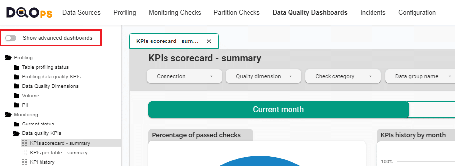
Switching view between basic and advanced dashboards
In DQOps the dashboards are divided into two groups: basic and advanced dashboards.
The toggle button Show advanced dashboards at the top of the tree view allows to toggle between displaying only basic dashboards or both basic and more advanced dashboards.
Filtering
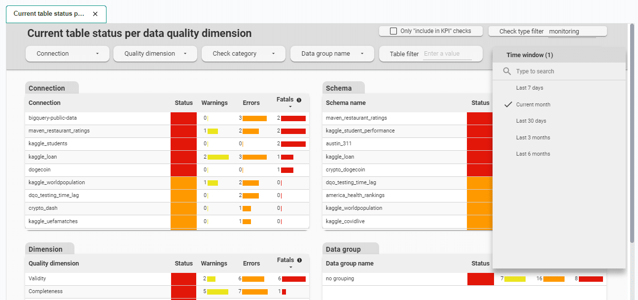
On each dashboard, data can be filtered. You can filter data by clicking on the dropdown buttons located on the dark gray top part of the dashboard, or clicking on the elements in the tables such as the Connection, Schema, Dimension, Data group, etc. Some dashboards have additional filtering options such as checks boxes or input fields.

The following example shows the filtering of data by a connection named bigquery-public-data after clicking on it.
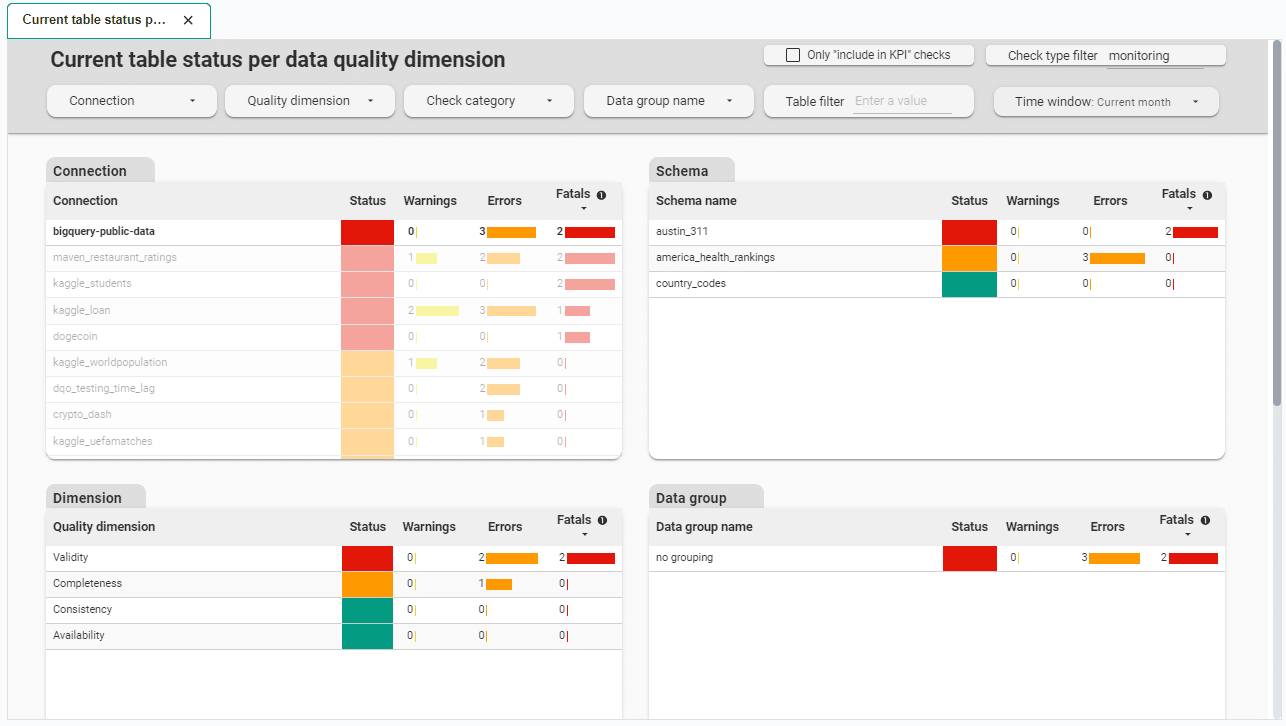
Data on dashboards is displayed for a specific time range, most often for the current month. Depending on the type of dashboard, you can change the specific time range using Time window dropdown button located on the top part of the dashboard.
Other dashboards have buttons to change the view between the current and previous month.

Export data presented in dashboard
You have the option to export data presented in dashboards for use in other tools. To export data from a table or chart, follow these steps:
-
Hover over the table or chart you wish to export.
-
Right-click on the chart or click three dots icon and select Export.

-
Enter a name for your export and select an Export As option:
- CSV creates a comma separated text file.
- CSV (Excel) creates a comma separated text file where non-ASCII characters are encoded properly for use in Excel.
- Google Sheets sends your data directly to Sheets.
-
Select the Keep value formatting option if you wish to retain the number and date formats applied in Looker Studio in the exported data.
What's next
- Check the detailed manual of how to run data quality checks using the check editor.
- Learn about setting schedules to easily customize when checks are run.