Last updated: September 17, 2024
Review data quality results on data quality dashboards
This guide will show how to use the data quality dashboards provided by DQOps and how to review your first data quality KPI score after profiling the data.
Overview
In the previous step, we reviewed the results from the data quality assessment and automatically configured data quality checks to detect the most common data quality issues. We ran those check, reviewed the first results, and created an incident notification for data quality issues. Now, let's review the results on the data quality dashboards.
In DQOps, you can choose from a variety of built-in dashboard groups. You can read more about the data quality dashboards in the DQOps concepts section.
Prerequisite
To display results on data quality dashboards, you need to synchronize locally stored results with your DQOps Cloud account.
To synchronize all the data, click the Synchronize button in the upper right corner of the navigation bar.
Complimentary data quality data warehouse for FREE accounts
DQOps provides a complimentary data quality data lake and data quality data warehouse for users using a FREE license of DQOps Cloud.
Due to capacity constraints, a limited number of new users who register a FREE DQOps Cloud account are granted access to the data warehouse. This allows them to synchronize data quality results with the data quality data warehouse and use the data quality dashboards for free. New grants are released every day.
Navigating dashboards
To view dashboards, simply go to the Data quality dashboard section, and select the dashboard of interest from the tree view on the left. There are several groups and subgroups of data quality dashboards dedicated to analyzing results from data quality checks.

In DQOps, the dashboards are divided into two groups: basic and advanced dashboards.
The toggle button Show advanced dashboards at the top of the tree view allows you to toggle between displaying only basic or both basic and more advanced dashboards.
Review the Current column status
Current status dashboards allow data engineers and data owners to quickly evaluate the data quality of monitored tables and columns. The dashboards display a color-coded status that indicates the severity level detected by run checks. When the status is green, it means that the monitored column has no data quality issues. However, if the status is yellow, orange, or red, it indicates that some issues were detected. The dashboard also displays the number of detected issues per severity threshold, making it easier to identify and address tables and columns with issues.
On top of the Current column status dashboard, you can review a summary of executed checks and their results, categorized by severity level. You can filter the data on the dashboard simply by clicking on the filters on the top part of the dashboard, as well as clicking on the name of the connection, schema, data group, etc.
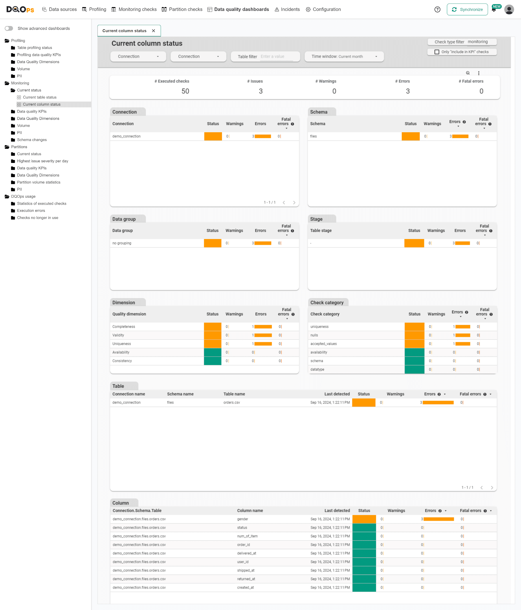
In our example, we ran 50 monitoring checks and reported 3 issues in error severity level. The results are broken down by column name in the Column table at the bottom of the dashboard.
Review the Data quality KPIs
Data quality KPIs are the calculated percentage of passed data quality checks. Data quality KPIs dashboards show high-level data quality KPIs aggregated on a macro scale that can be shared at a corporate level. To read more about data quality KPIs, check DQOps concept section.
Data quality KPIs dashboards review key data metrics per connection, data quality dimensions, check category and data grouping.
To review the summary KPIs of all run checks use the KPIs scorecard - summary dashboard located in the Data quality KPIs group.

Our example's calculated percentage of passed data quality checks (KPI) is 90.9%. On other dashboards in KPIs category, you can also review KPIs results broken down by table, months and days, data quality dimension, or check category.
Review the Current validity issues on columns
The Data Quality Dimensions group contains dashboards dedicated to different data quality dimensions, such as availability, completeness, timeliness, consistency, and validity.
Current validity issues on columns is a representative of the Validity subgroup. This dashboard summarizes results from the most recently executed checks categorized in the validity dimension.
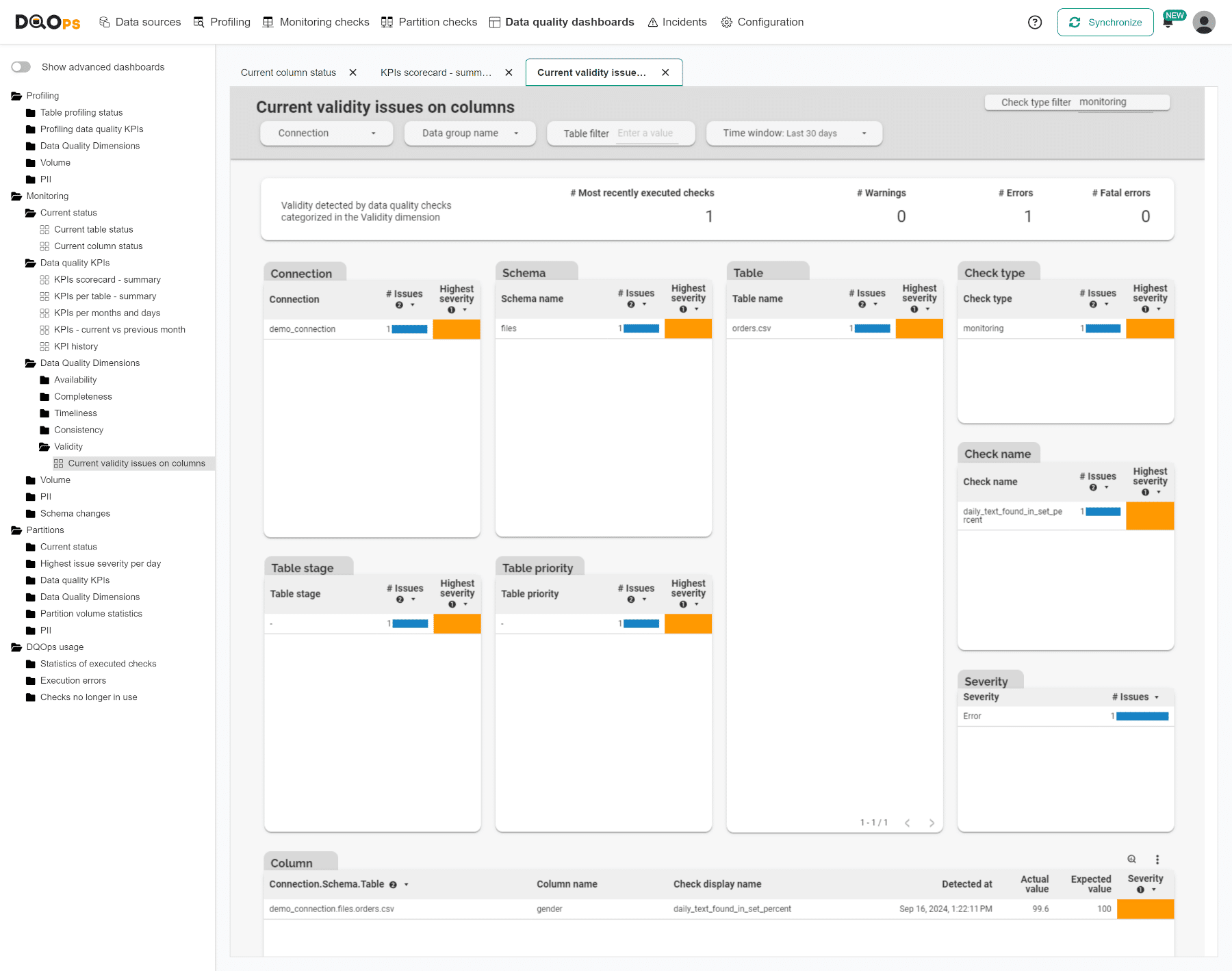
Here, we can see that only one Validation check was executed, which resulted in an error. The Column table at the bottom of the dashboard breaks down the results by column and check names. The check that resulted in an error is daily_text_found_in_set_percent, and you can see the actual and expected values of the check.
You have completed our quick tutorial, and now you know how to add connections, run basic statistics and data quality checks, as well as view results.
Next steps
- Check the Categories of data quality checks section to learn how the types of popular data quality checks are divided into categories and what categories of checks are supported by DQOps
- We have provided a variety of use cases that use openly available datasets from Google Cloud to help you use DQOps effectively. You can find the full list of use cases here.
- The data in the table often comes from different data sources and vendors or is loaded by different data pipelines. Learn how data grouping in DQOps can help you calculate separate data quality KPI scores for different groups of rows.